Overview
The estimated time to complete this lab is 45 minutes.
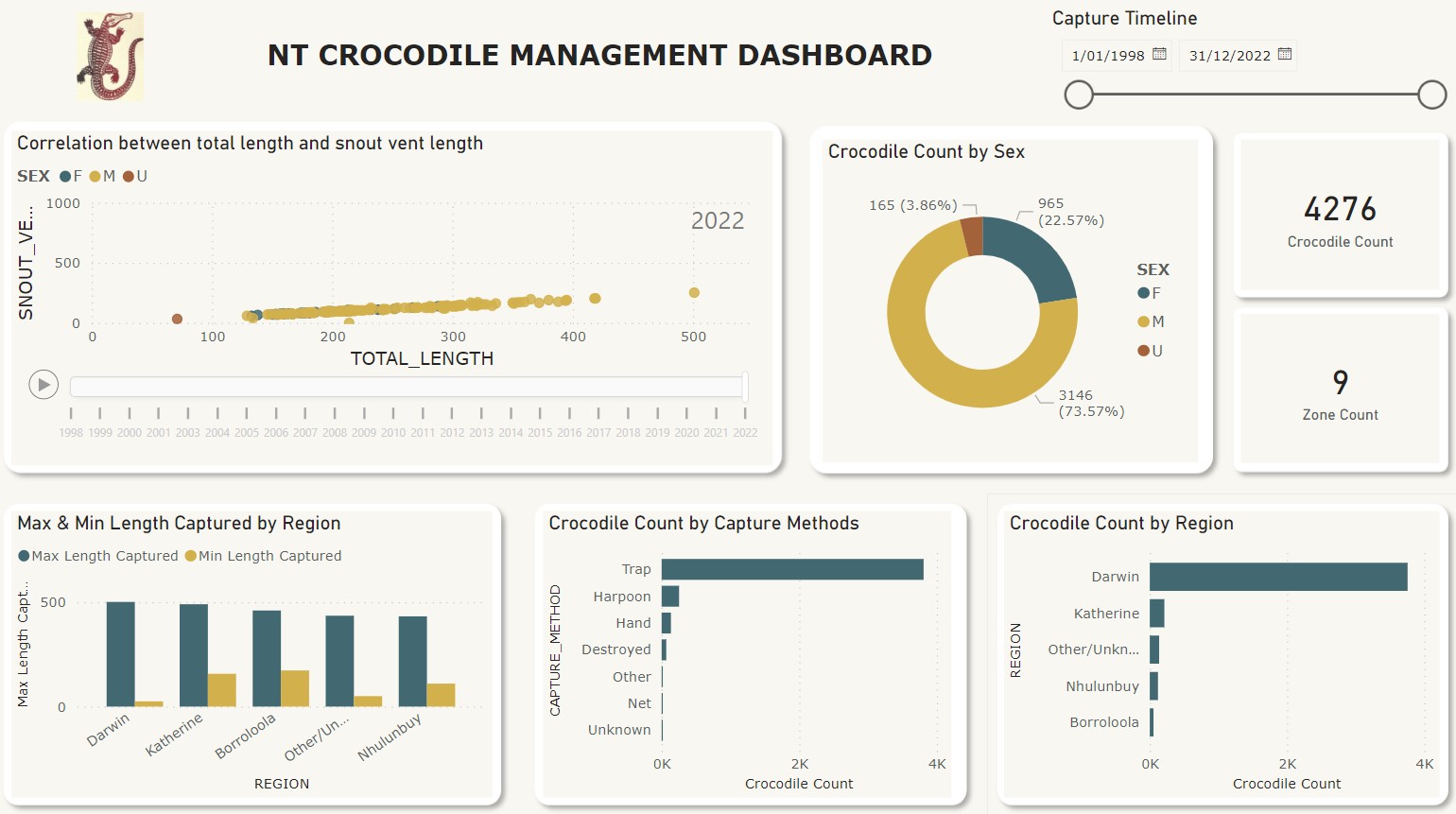
In this lab, you will utilise one of Power BI’s more powerful visualisations – the Key
Influencers visual, and combine it with your captures data to explore the biggest
drivers behind increased/decreased captures. You will learn other techniques that can
help understanding including the Power BI service insights and adding additional
data for meaning based on a customer feedback example.
Visuals that appeal
Visualisation is the icing of the Power Query and DAX cake