Exercise 2: Build some interesting charts
In this exercise, you will build a donut chart, a clustered column chart and 2 clustered bar
charts.
Task 1: Build a donut chart
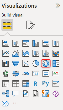
- Under Visualisations > Build Visual > Select Donut chart.
10. Under Fields section, drag and drop Crocodile Count from General Measures table and
SEX field from All Captures table.
11. Change the unit display by changing Display units under Values section. Select “Format
your visual” > Turn on “Details labels” > Expand Values > Under Display units, choose None.
12. Arrange your donut chart next to Scatter chart.
13. This chart provides a representation of the percentage of each crocodile sexes.
Task 2: Build a clustered column chart
14. Under Visualisations > Build Visual > Select Clustered column chart.
Power BI in 2 Days: Lab 04 ©2022 Cloudstreet Consulting. All rights reserved 6
15. Under Fields section, drag and drop “Max Length Captured” and “Min Length Captured”
from General Measures to Y axis.
16. Under All Captures table, drag and drop REGION field to X axis.
17. Give it a new name, such as “Max & Min Length Captured by Region” and arrange this
chart under Scatter chart.
Task 3: Create 2 clustered bar charts
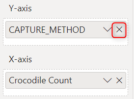
18. Under Visualisations > Build Visual > Select Clustered bar chart.
19. Under Fields section, drag and drop Crocodile Count from General Measures to X axis.
20. Drag and drop CAPTURE_METHOD from All Captures to Y axis.
21. Give it a new name, for example “Crocodile Count by Capture Methods” and arrange it
next to Clustered column chart.
22. Select the chart > Ctrl + C to copy > Ctrl + V to paste. This is a quick way to create similar
charts.
23. Select the chart then remove CAPTURE_METHOD field from Y axis.
24. Drag and drop REGION under All Captures table to this Y axis.
25. Give it a new name “Crocodile Count by Region” and then arrange it next to the first
clustered bar chart.